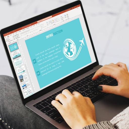
Making a PPT
Presentations | English
Slideshows are quick to produce, easy to update and an effective way to inject visual interest into almost any presentation. However, slideshows can also spell disaster even for experienced presenters. The key to success is to make certain your slideshow is a visual aid and not a visual distraction. Use the slide master feature to create a consistent and simple design template. It is fine to vary the content presentation (bulleted list, two-column text, text and image, etc.), but be consistent with other elements such as font, colors and background.Simplify and limit the number of words on each screen. Use key phrases and include only essential information. Limit punctuation and avoid putting words in all-capital letters. Empty space on the slide will enhance readability. Use contrasting colors for text and background. Light text on a dark background is best. Patterned backgrounds can reduce readability. Avoid the use of flashy transitions such as text fly-ins. These features may seem impressive at first but are distracting and get old quickly.

Free
PPTX (36 Slides)
Making a PPT
Presentations | English
