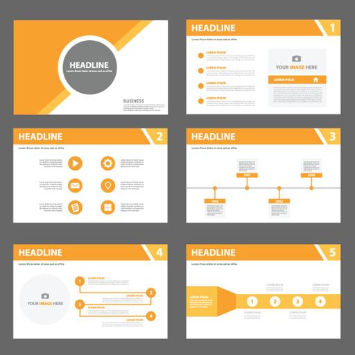
How to Make Better PowerPoint Presentations
Presentations | English
It’s not surprising that PowerPoint slideshows have become the norm for visuals in most business presentations. Slideshows are quick to produce, easy to update and an effective way to inject visual interest into almost any presentation. It is fine to vary the content presentation but be consistent with other elements such as font, colours and background. Limit punctuation and avoid putting words in all-capital letters. Empty space on the slide will enhance readability. Use contrasting colours for text and background. Light text on a dark background is the best. Patterned backgrounds can reduce readability. Overuse of special effects such as animation and sounds may make your presentation bad and could negatively affect your credibility. Use good-quality images that reinforce and complement your message. Ensure that your image maintains its impact and resolution when projected on a larger screen. Simplify and limit the number of words on each screen. Use key phrases and include only essential information.

Free
PPTX (29 Slides)
How to Make Better PowerPoint Presentations
Presentations | English
